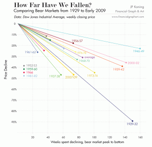
I saw this today and thought it worth sharing. Barry Ritholtz has a great blog called The Big Picture that is essential daily reading. I saw this graph today in one of his posts (via JP Koning).
I don't know how much further we'll go (meaning we'll go down more) but this at least puts this decline into a bit of perspective.
